As many of you know, WordPress is in the middle of developing a brand-new editor called Gutenberg, which will present an entirely new way of publishing content: using a block level approach. It is currently available as a plugin, and will be shipped in WordPress 5.0.
The Gutenberg editor will revolutionize the way we publish content with WordPress, and many folks—myself included— are very excited about the expedited workflow and granular layout options the new editor has in store.
To give users a deeper level of control over the display of content, Gutenberg will offer a number of exciting features.
Theme Color Palettes
Among those features are Background Color and Text Color, which allow you to customize the way that text, paragraphs, and buttons appear on your website.
I can see plenty of other uses for these features, but for now, I’ll focus on the ones below—since they will be the most widely used.
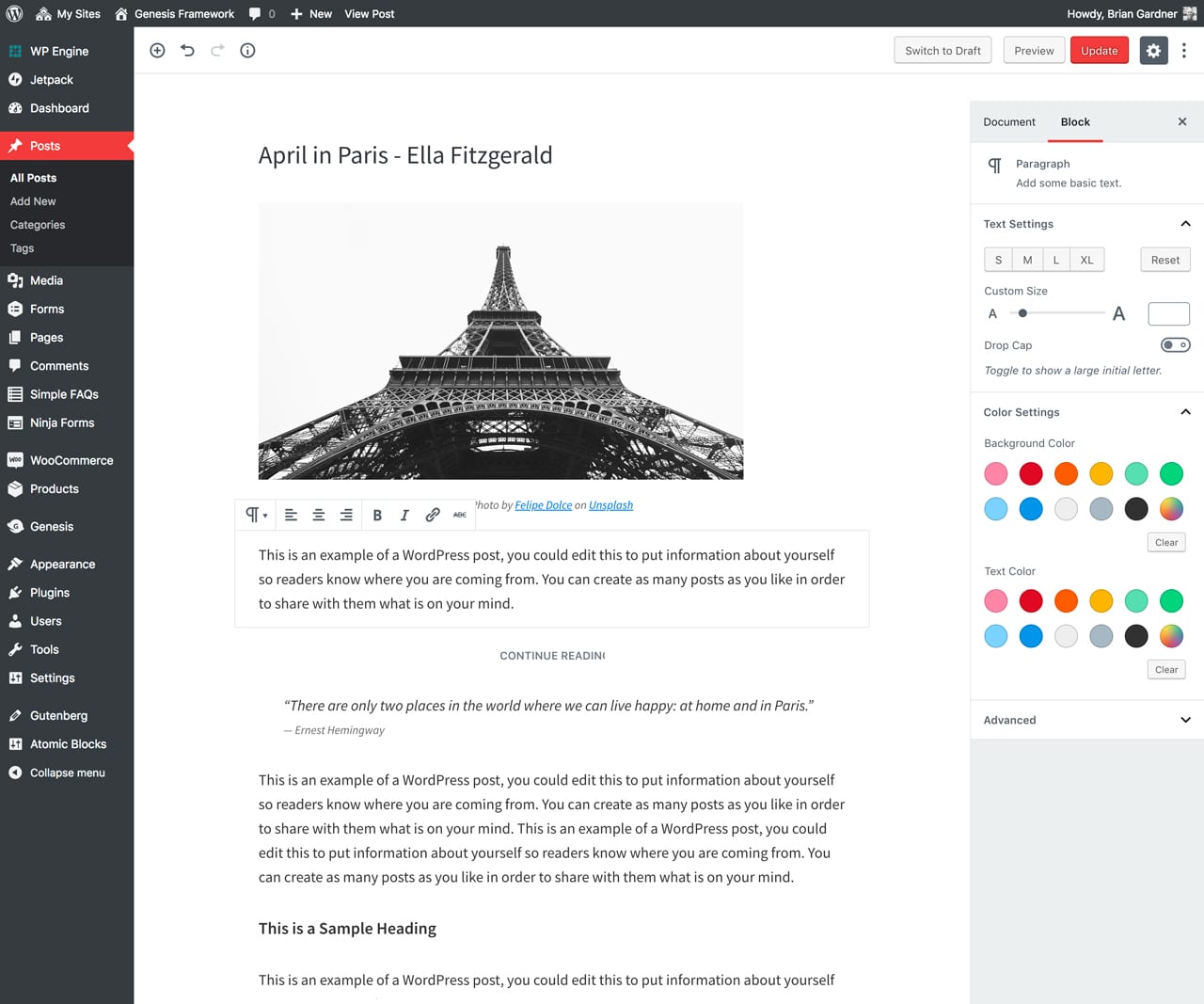
Before I show you how to add theme colors to the Gutenberg editor, here’s how the default controls appear in the dashboard:

The Gutenberg editor ships with 11 default colors, including pink, red, orange, yellow, green, blue, and gray. In addition, it will always include a color picker with the palette, for further customization.
This gives the user full control over what color is used for various elements, such as text, background, and buttons. But there is also a way to implement a unique color palette as well.
Custom Theme Color Palettes
One of the many benefits of WordPress is the extensibility it offers to designers and developers who build websites for clients.
The Gutenberg editor provides a method to create custom color palettes, which is especially helpful to end users and anyone who publishes content on a regular basis.
Below is the code that is used to add theme colors to the Gutenberg editor. This can be used to customize the Genesis Sample theme:
<?php
// Do NOT include the opening php tag.

// Adds support for editor color palette.
add_theme_support( 'editor-color-palette', array(
	array(
		'name'  => __( 'Light gray', 'genesis-sample' ),
		'slug'  => 'light-gray',
		'color'	=> '#f5f5f5',
	),
	array(
		'name'  => __( 'Medium gray', 'genesis-sample' ),
		'slug'  => 'medium-gray',
		'color' => '#999',
	),
	array(
		'name'  => __( 'Dark gray', 'genesis-sample' ),
		'slug'  => 'dark-gray',
		'color' => '#333',
       ),
) );
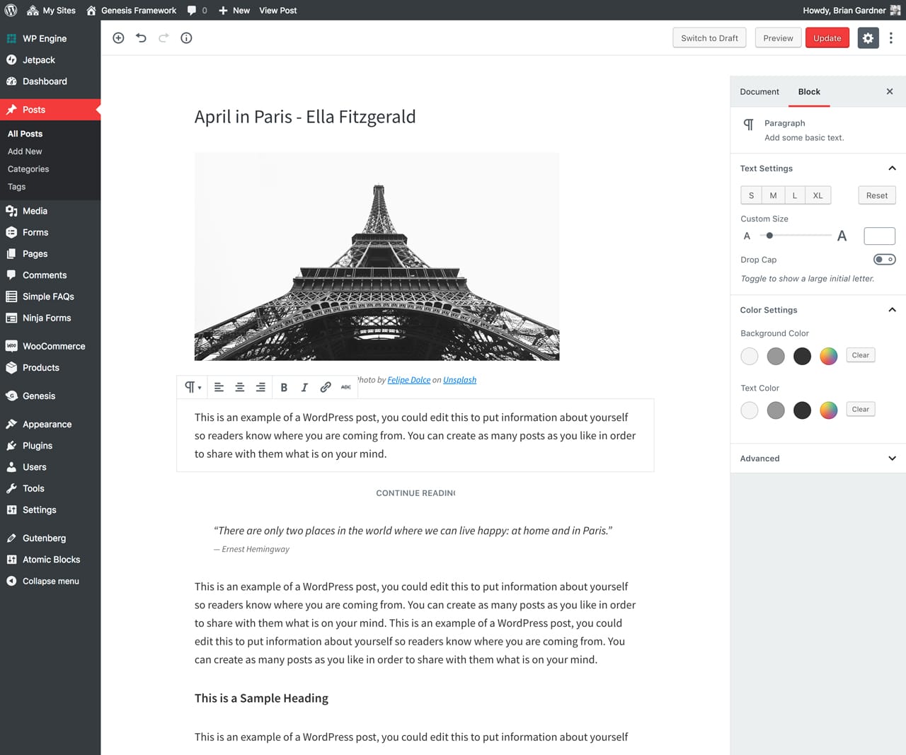
Note: The first 3 hexcodes #f5f5f5, #999, #333 are base colors found within the theme. You will also see that labeling each color is possible as well.
A screenshot that shows custom colors in the palette:

The color picker that is standard in the Gutenberg editor can be helpful. But let’s face it—there are plenty of instances when delivering that capability might be considered a suboptimal situation.
A designer or developer might prefer to remove that option from client use. Here’s the code that will remove the color picker:
<?php
// Do NOT include the opening php tag.

// Disables custom colors in block color palette.
add_theme_support( 'disable-custom-colors' );
A screenshot that shows the custom palette, sans color picker:

You might be wondering what some of the use cases would be for adding custom theme colors to your website. Hint: There are many.
Use Cases for Custom Theme Colors
The first—and most obvious—use for custom theme colors is to change the color of text. Perhaps you wish to create a separate look for text, which is what I do at the beginning of my blog posts.
An example of this would be using custom theme colors in the Gutenberg editor to style an intro paragraph, paired with italics, and centered text.
Beyond that, you might want to provide a content box within your entry, which points out something specific to your reader.
Or quite possibly, you may want to display a call-to-action button, putting emphasis on the action you want your visitor to take.
Genesis and Block Options
We have exciting news! The newly expanded Genesis engineering team is currently working on the integration of Gutenberg functions directly into Genesis.
The idea is for Genesis to do the heavy lifting of code, while we supplying a config system in the child themes to handle the data. While the instructions in this post are a manual way of adding color pallets to Gutenberg blocks, we’ll be releasing features in Genesis that make this much easier.
This would allow us to ship themes with pre-configured options that are easy to customize and extend further, while allowing you to control block options in your own custom child themes!
Additional Resources
Below is a list of resources that will help you understand building and styling themes with better integration for the Gutenberg editor:
- Styling Themes for Gutenberg — ThemeShaper
- Gutenberg Theme Support — WordPress.org
- Gutenberg, or the Ship of Theseus — Matias Ventura
- Getting your theme ready for Gutenberg — Bill Erickson
- How to add WordPress Theme Styles to Gutenberg — Rich Tabor
Note: The Theme Color Palette feature has been added to the Beta branch of the Genesis Sample theme. We invite you to download this version for testing. Feel free to report any bugs you might find in the GitHub repository.
