The repeater field is definitely my personal favorite feature of Genesis Custom Blocks Pro. It unlocks so much potential with such little effort. With the repeater field, you can build simple blocks that output some incredible components for your site.
For example, this “Services Grid” for a web agency of all the services they offer alongside web design and development (hit play to see it in action):
It looks super slick, but it’s pretty simple really under the hood.
You could actually build much of the above with core blocks like the image, text, and columns blocks, but for me, it comes down to having fine-tuned control over my styling. I wanted to be pretty specific about the behavior of the text and images in these, especially on hover of the tiles. Note particularly the way each tile expands (transform: scale) on hover. All that to say, I wanted fine-tuned control and a custom block is what gives me that.
So let’s build this eh!
Adding and Configuring the Block
With Genesis Custom Blocks Pro installed and active, we add a new block. We set up the basic details:
- Name: Services Grid
- slug:
services-grid - Icon: the grid like one
- Category: Text
Adding the Fields
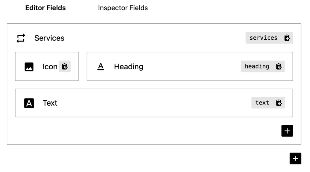
Let’s now add the fields for our block. The first field we add is a repeater field and it is within this field we add the fields for each service tile. The fields (repeater + sub fields) are:
| Field Type | Field Name | Field Slug |
|---|---|---|
| Repeater | Services | services |
| Image | Icon | icon |
| Text | Heading | heading |
| Textarea | Text | text |
With all fields in the Editor area and some tweaks to the sub field widths, we end up with it looking like this in the UI:

You can see how the “Services” repeater field contains the other 3 sub fields.
The Block Templates
With that done, we can switch now to building out our block templates. If templating with Genesis Custom Blocks is new to you, I recommend you check out this tutorial. If you’ve done this before though, carry on.
Because of the repeater field, we will be interacting with a couple of unique PHP functions. The docs for these are here, but pay careful attention to our template code below:
<div class="gcb-services-grid">
    <?php
    if (block_rows('services')) :

        while (block_rows('services')) :
            block_row('services');
    ?>
            <a href="">
                <div class="gcb-services-grid__img-container">
                    <img src="<?php block_sub_field('icon'); ?>" alt="<?php block_sub_field('heading'); ?>">
                </div>
                <h4><?php block_sub_field('heading'); ?></h4>
                <p><?php block_sub_field('text'); ?></p>
            </a>

    <?php endwhile;
    endif;

    reset_block_rows('services');
    ?>
</div>
So, a few things to take note of here:
- We have a couple of CSS classes (
gcb-services-gridandgcb-services-grid__img-container) which we’ll use for our styling - We check first if there is anything in our block content by using an
ifcheck onblock_rowspassing in theservicesslug of our repeater field - We then initiate a
whileloop using that sameblock_rowsfunction - Then for each “row” of our repeated content we are able fetch and interact with its content via the
block_sub_fieldfunction and the 3 x sub field slugs - We wrap all of this up in some nice and simple HTML
The code above is all placed in our block.php template file.
Our CSS, although simple, is a few more lines. Of course, yours would be unique to your site, but here’s mine for inspiration:
.gcb-services-grid {
    display: grid;
    grid-template-columns: repeat( 3, 1fr);
    gap: 20px;
}

.gcb-services-grid a {
    border-radius: 10px;
    padding: 20px;
    border: 1px solid #e1e8ed;
    text-decoration: none;
}

.gcb-services-grid__img-container {
    display: flex;
    align-items: center;
    justify-content: center;
    width: 40px;
    height: 40px;
    border-radius: 8px;
    background-color: rgba(40,114,250,0.2);
}

.gcb-services-grid img {
    fill: currentColor;
    color: #1559ed;
}

.gcb-services-grid h4 {
    font-size: 16px !important;
    margin-top: 12px !important;
    color: #1559ed !important;
}

.gcb-services-grid p {
    font-size: 14px;
    margin-bottom: 6px !important;
    color: #3a4f66;
}

.gcb-services-grid a:hover {
    background-color: #1559ed;
    border-color: #1559ed;
    color: #fafbfc;
    transform: scale(105%);
}

.gcb-services-grid a:hover .gcb-services-grid__img-container {
    background-color: #fafbfc;
}

.gcb-services-grid a:hover h4,
.gcb-services-grid a:hover p {
    color: #fafbfc !important;
}
Things to note:
- We’re using CSS grid for layout here. Particularly useful with the
gapproperty - We use the the
:hoverpseudo selector to give us our hover state styles - I have to use
!importantin a few places to ensure styles are represented in the editor as they are on the frontend
All of the above finds a home in the style.css template for our block.
These template files all live within a child theme and are structured like:
child-theme/
    blocks/
        services-grid/
            block.php
            style.css
Using the Block
With that all said and done, our custom block is ready to go!
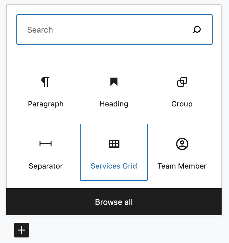
In the editor, you can see we can add the block as we would any other:

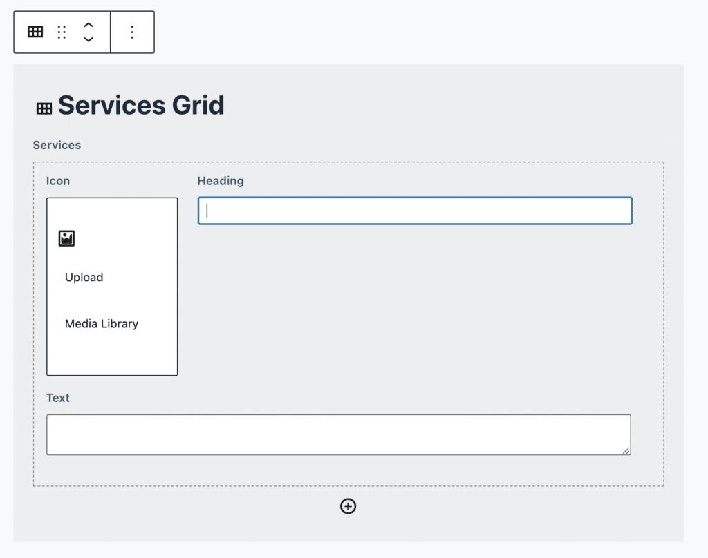
When we add the block, we can start adding rows and then input data to each field within each row:

And once we add 9 rows and add all our content to all the fields we get (hit play to see it in action):
Wrapping things up
Simple, but it’s these kinds of web components I find the most empowering in web design. For the content creator, the inputs are super simple and refined, but for what the block adds to a website, it’s pretty epic!
A couple of things that could be done to further improve this block:
- CSS media queries to adjust our
gridcolumns for different screen sizes - Add a color field to the block, or even as a sub-field within the repeater, for some cool color options
- A little more attention in the
phptemplate file for accessibility etc.
Hope you like this one! Until next time, happy block building!
