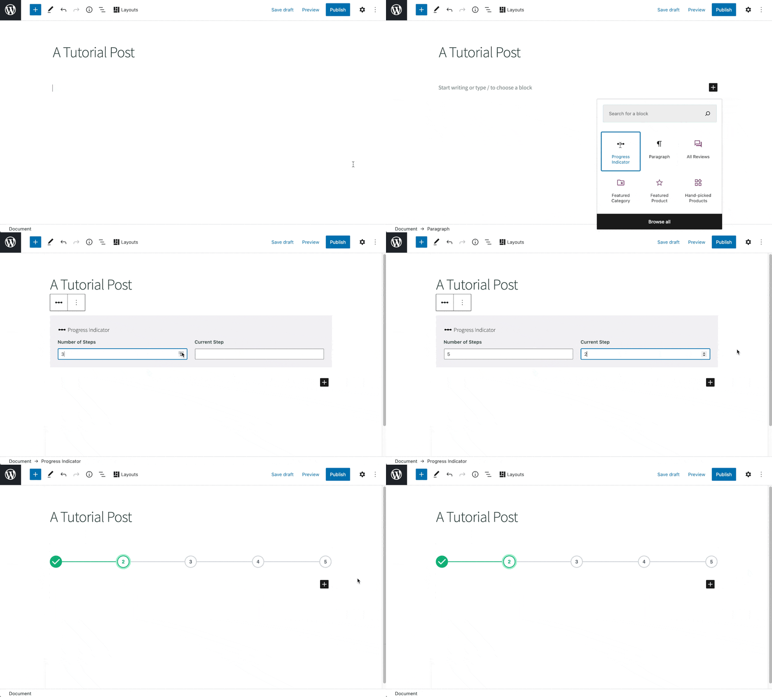
It’s time for another round of inspiration! In this post I’m going to show you how you can build a completely custom “Progress Indicator” block. Think of it as the kind of block that would be useful for content broken out over a couple of posts or pages.
E.g:
- Multi-part tutorials
- Recipes
- Content heavy reports
- General long-form articles
When done, ours is going to look like this:

Remember though, you can roll with this however you like. That’s the beauty of Genesis Custom Blocks. It empowers you to build custom blocks that look and behave exactly the way you need.
Like it shows in the above gif, the block will let you select how many “steps” there are in the process and then select which is the “current step”. So imagine you had a 3 part tutorial; you could add this block to each page, with “3” set as the number of steps, and then select the relevant current step. The interesting thing about this block is the way we conditionally interact with the block fields in our template.
Step 1: Add and configure the block.
With Genesis Custom Blocks installed and active, we hit Custom Blocks > Add New.
After the basic things like “title”, “icon”, and “keywords”, we add our 2 fields.
| Name | Slug | Field Type |
| Number of Steps | steps | Number |
| Current Step | current-step | Number |

Nothing too crazy there.
Hang on a second… What be that at the top of the screen?
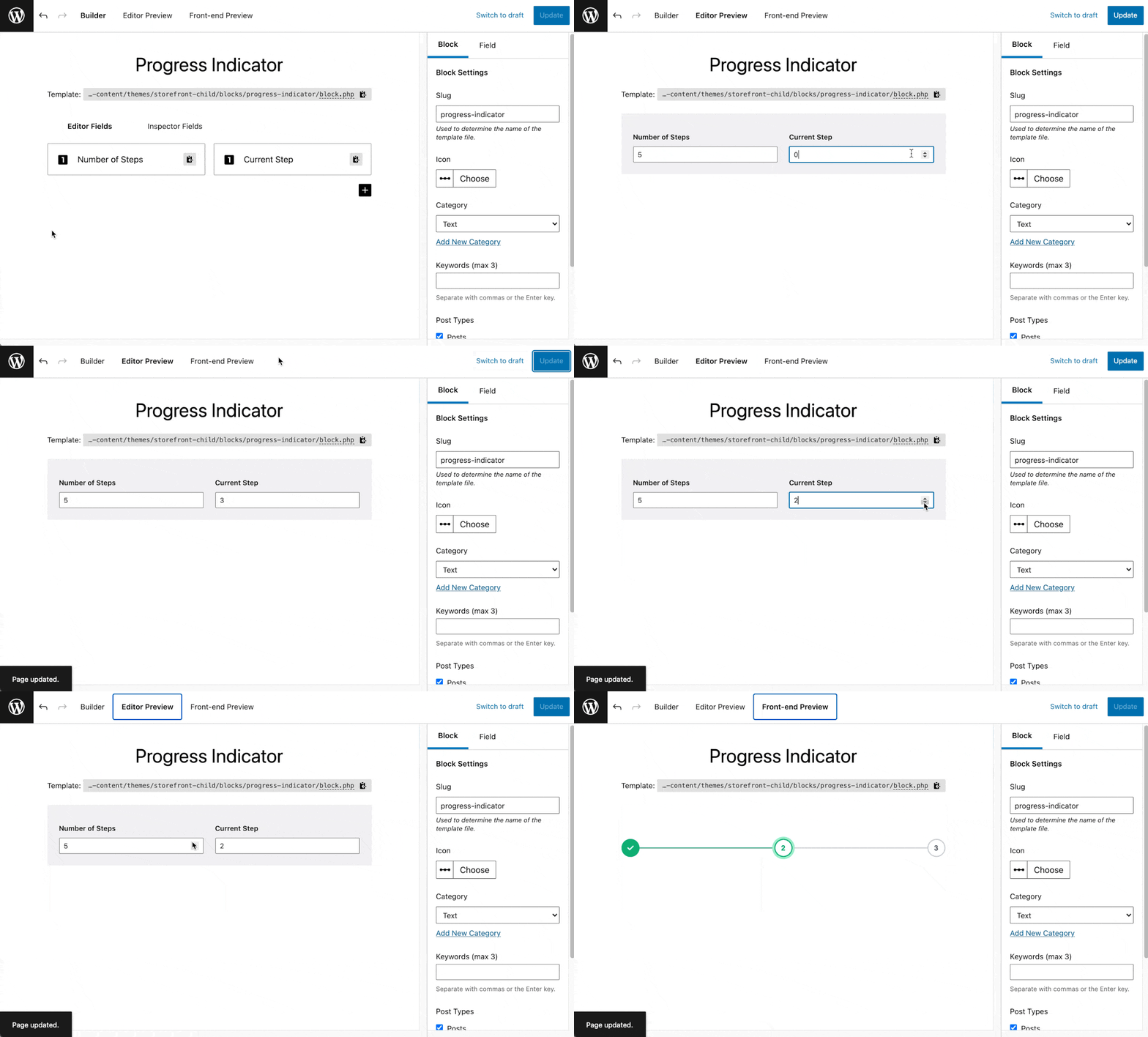
We have 2 new tabs available to us for testing and previewing our blocks. You used to have to spin up a post or page to play around with your block as you were building it, but now we can do it all right within our block builder interface.
The first tab lets us interact with the form as it will appear in the block editor. The second block previews how it will appear on the front end of the site. More on this later.
Step 2: Building the template files
This time we’re going to add our template files in our child theme, but if you prefer, I have another tutorial here that shows you how you can add your template files in a plugin.
In our child theme we add a couple of folders and files like this:
child-theme/
	blocks/
		progress-indicator/
			block.php
			block.css
Starting with our PHP template file, this is what I wrote. Have a look and then read on further where I’ll break it all down.
<?php
$steps = block_value('number-of-steps');
$current_step = block_value('current-step');
?>

<div class="gcb-progress-indicator">

<!-- Step Lines  -->
<div class="gcb-progress-indicator__lines">
    <?php
    for ( $i = 1; $i < $steps; $i++ ):
        $line_classes = $i < $current_step ? 'gcb-progress-indicator__line gcb-progress-indicator__complete-line' : 'gcb-progress-indicator__line';
        ?>
        <div class="<?php echo esc_attr( $line_classes ); ?>"></div>
    <?php endfor; ?>
</div>

<!-- Step Numbers -->
<?php for ( $i = 1; $i <= $steps; $i++ ):
    $step_classes = 'gcb-progress-indicator__step';
    if ($i === $current_step) {
        $step_classes .=
            ' gcb-progress-indicator__current-step';
    } elseif ($i < $current_step) {
        $step_classes .=
            ' gcb-progress-indicator__complete-step';
    }
    ?>

    <div class="<?php echo esc_attr($step_classes); ?>">
        <?php if ($i < $current_step) {
            echo '<svg></svg>';
        } else {
            echo esc_html($i);
        } ?>
    </div>

<?php endfor; ?>
</div>
Ok. Let’s break this down:
- In the first 4 lines I set up a couple of variables with the
block_valuefunction that the Genesis Custom Blocks plugin gives us. This function fetches the data the end user will put in the block form when adding the block to a post or page. - In the next 2 sections, I have 2
forloops that place on the page the lines that connect our steps and then the step circles themselves. Because of the way I wanted these to interact and the way I wanted to write the CSS, I separated them. Note: there’s possible a better / more efficient way to do this with a single for loop. - In the first for loop I output a
divfor our lines that:- Has a base CSS class
- Has a
gcb-progress-indicator__complete-lineclass conditionally (using a ternary operator) based on whether the index is less than thecurrent_stepvariable
- In the second
forloop I set up a variable for our step styling. The styling changes on whether the step is complete, current, or not. - Also in the second loop I conditional output either a
svg(checkmark) for if a step is complete or the index number if it is not. - Note: for the sake of brevity, I only show the opening / closing SVG tags in the above snippet. MIT licensed library here where you can find the full SVG snippet.
Phew! It might take you a few times looking over that all to understand, but let me show you the CSS as it will help demonstrate why I broke the “lines” and the “steps” into two sections.
.gcb-progress-indicator {
    position: relative;
    display: flex;
    width: 100%;
    align-items: center;
    justify-content: space-between;
    margin-top: 4rem;
    margin-bottom: 2rem;
}

.gcb-progress-indicator__lines {
    position: absolute;
    width: 100%;
    display: flex;
    height: 34px;
    align-items: center;
    padding-left: 17px;
    padding-right: 17px;
}

.gcb-progress-indicator__line {
    flex-grow: 1;
    height: 2px;
    background-color: #D1D5DB;
}

.gcb-progress-indicator__complete-line {
    background-color: #10B981;
}

.gcb-progress-indicator__step {
    position: relative;
    display: flex;
    align-items: center;
    justify-content: center;
    height: 34px;
    width: 34px;
    background-color: #fff;
    color: #6B7280;
    border-radius: 20px;
    border: 2px solid #D1D5DB;
    font-size: 14px;
    font-weight: 600;
    font-family: sans-serif;
}

.gcb-progress-indicator__current-step {
    color: #10B981;
    border: 2px solid #10B981;
    box-shadow: rgb(255, 255, 255) 0px 0px 0px 0px, rgb(167, 243, 208) 0px 0px 0px 4px, rgba(0, 0, 0, 0) 0px 0px 0px 0px
}

.gcb-progress-indicator__complete-step {
    background-color: #10B981;
    color: #ECFDF5;
    border: 2px solid #10B981;
}
What we have here:
- A general class for a
divthat wraps the whole block - A class for the container of the lines. Note how this is absolutely positioned so it will site behind the relatively positioned circles.
- A base class + the variants for the lines
- A base class + the variants for the steps (circles)
- I use Flexbox with vertical (
align-items), horizontal (justify-content), andflex-growto place the lines and steps where I want within the block. I love the use of Flex here as it means everything is perfectly aligned and spaced without needing to do any calcs in my CSS or JS.
Let’s check now in our preview tabs what the block looks like. First thing we need to do is check the editor preview, which gives us the form. Throw some data at it and then toggle to the Front-end preview tab:

Super simple, but super cool!
There are a bunch of other ways we could build this out. Here are some ideas:
- Use the repeater field in Genesis Custom Blocks Pro. We could expand on what is included in steps this way. I.e. Step label / name or step anchor (link).
- Add styling controls for step shapes, colors, etc
- Add next and previous step buttons
Wrapping it up
I hope you liked this one! If you want to play around with it, this zip here contains the block export + the template files.
Until next time, happy block building!
