Just want the custom block files? Here ya go!
There are some related products features that come out of the box with WooCommerce. However:
- They’re not a block 🙁
- They only work on product pages
So what if you are writing up a blog post, or even building a standalone landing page, for a particular product – say something that showcases something from your “2021 Product Collection”. You could drop individual products on the page, but if you have a larger catalogue of products… wouldn’t it be nice to have a block that just does it all for you?
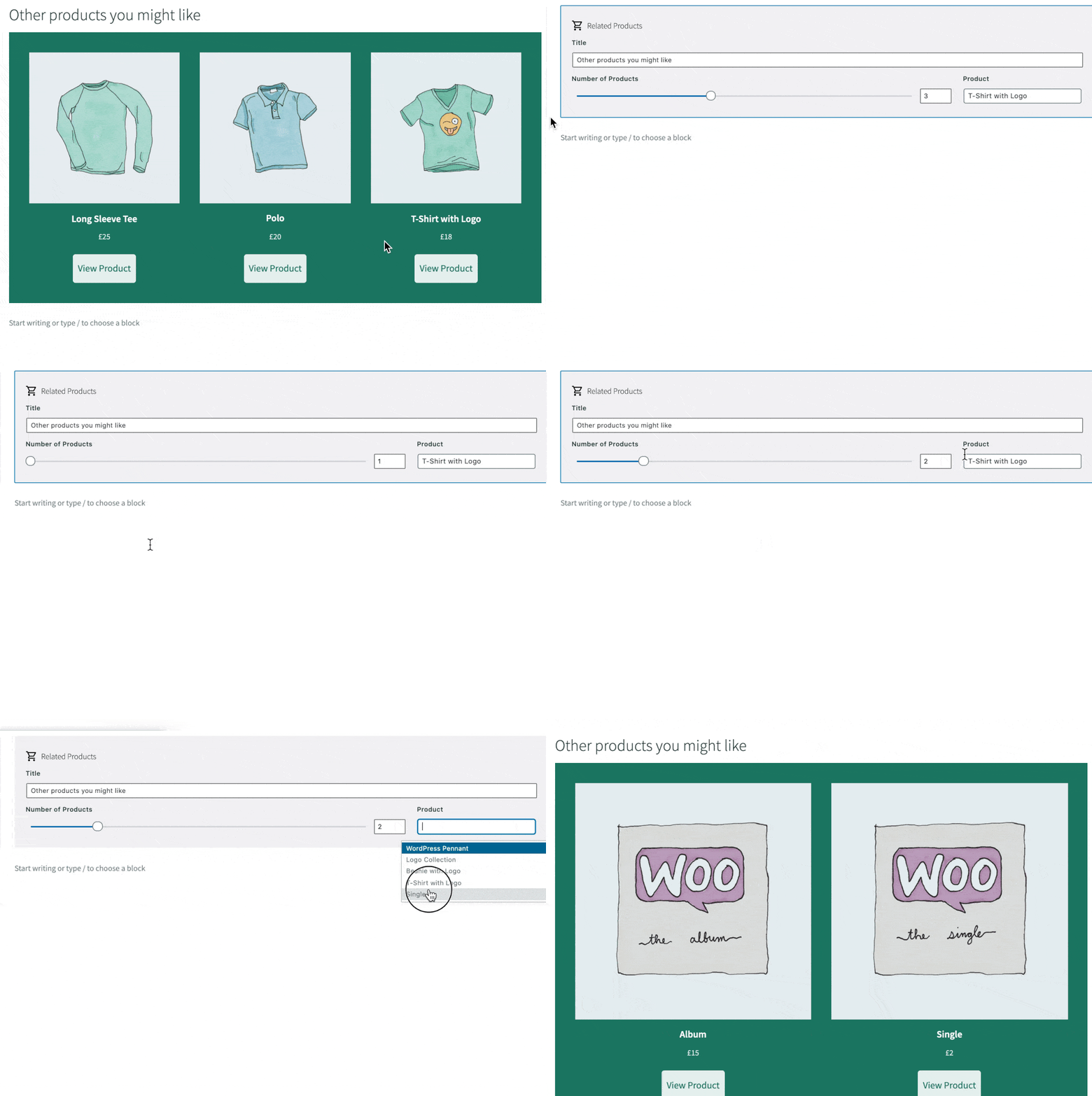
So, let’s build it. A custom block that lets you select a product from your store, which then displays 1-6 other related products in a grid.
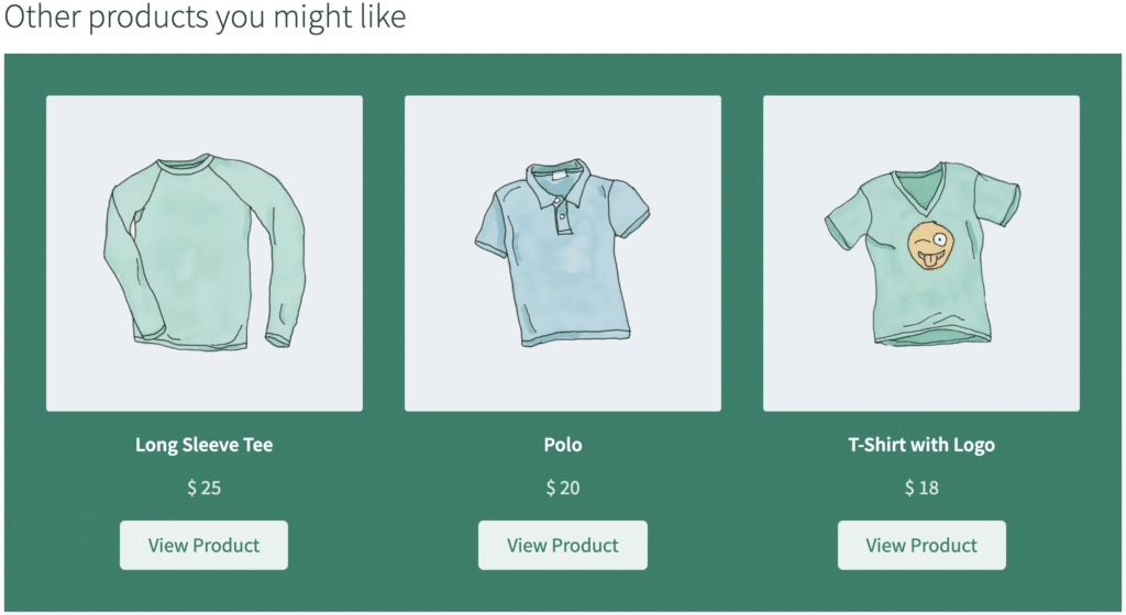
When we’re done, it will look like this:

We’ll be using Genesis Custom Blocks for this, so if that’s new to you, go check out this previous tutorial for the 101. I’ll assume you’re ok though and jump right into the block building.
Step 1: Adding & Configuring the Block
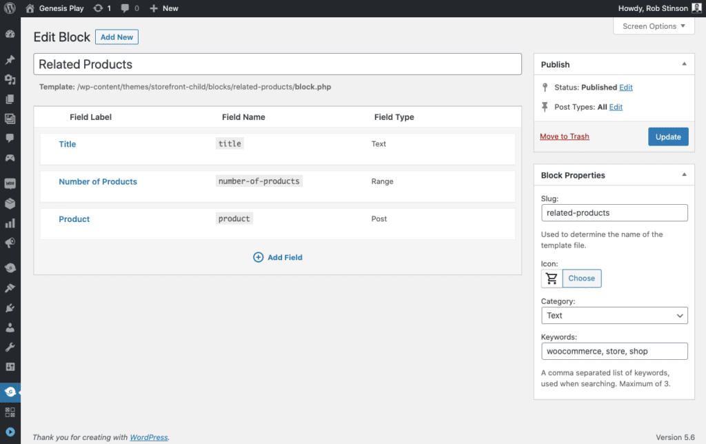
With the plugin installed and active, we add a new block and set it up like this:
- Title: Related Products
- Slug:
related-products - Icon: the shopping cart one
- Tags: woocommerce, store, shop
We also add our block fields. These are:
Field Label / Name | Field Type | Details |
Title/ title | Text | Location: Editor |
Number of Products / number-of-products | Range | Location: Editor Min: 1 Max: 6 Default: 3 |
Product / product | Post | Location: Editor Post Type: Product |
It’s important to call out that the Post field type is a Pro field that you can access via a Genesis Pro subscription. For a non-Pro alternative, you could use a Number field, and request the ID of the starter product.
In the block builder, it looks like this:

Step 2: The Block Template
Our folder / file structure will sit in the top-level of our theme, and looks like this:
storefront-child/
    blocks/
        related-products/
            block.php
            block.css
In our block.php template file we have 3 sections. The first we set up a few variables we will need to interact with:
//Variables
$number_of_products = block_value( 'number-of-products' );
$selected_product = block_value( 'product' );
$selected_product_id = $selected_product->ID;
$selected_product_categories = get_the_terms( $selected_product_id, 'product_cat' );
$selected_product_first_category_slug = $selected_product_categories[0]->slug;
$grid_cols = 3;
$product_tile_class = '';

if ( $number_of_products < 3 ) {
    $grid_cols = $number_of_products;
};

if ( $number_of_products === 1 ) {
    $product_tile_class = ' gcb-related-products__single-product';
};
Let’s break these variables down:
- Number of products to display. Uses the block_value() function to fetch the value entered by the user into the block.
- The slug of the product category (custom taxonomy in Woo) of the selected product. We cycle through a few variables to get this.
- The default number of columns in our grid (3)
- A CSS class for when the product count is 1 and we will style the block differently
- If the number of products to display is less than 3, we set the number of grid columns to the same
- If the number of products to display is 1, we assign the gcb-related-products__single-product CSS class to the $product_tile_class variable
The next part of the template is using WP_Query. Here’s another block I built earlier this year that uses WP_Query if you’re interested.
Setting up our arguments for the query looks like this:
$the_query = new WP_Query(
    array(
        'post_type'      => 'product',
        'posts_per_page' => $number_of_products,
        'tax_query'      => array(
            array(
                'taxonomy' => 'product_cat',
                'field'    => 'slug',
                'terms'    => $selected_product_first_category_slug,
            ),
        ),
    )
);
Take particular note of:
- We use the $number_of_products variable to define how many products we want the query to return
- We use the $selected_product_first_category_slug variable in tax_query to make sure it only returns products from the category of the product the user selects when adding the block to a page
The next part of the template is the query itself, including the markup for the template.
// The Loop
if ( $the_query->have_posts() ) {
    ?>
    <h2><?php block_field( 'title' ); ?></h2>
    <div class="gcb-related-products" style="grid-template-columns: repeat(<?php echo esc_attr( $grid_cols ); ?>, 1fr);">
    <?php while ( $the_query->have_posts() ) {
        $the_query->the_post();
        ?>

        <div class="gcb-related-products__tile<?php echo esc_attr( $product_tile_class ); ?>">
            <img src="<?php echo esc_attr( get_the_post_thumbnail_url() ); ?>" alt="">
            <div>
                <h4><?php the_title(); ?></h4>
                <p>
                <?php echo get_woocommerce_currency_symbol();
                 $product = wc_get_product( get_the_ID() );
                 $thePrice = $product->get_price(); // Will give raw price.
                 echo $thePrice;
                ?>
                </p>
                <a class="button" href="<?php the_permalink(); ?>">View Product</a>
            </div>
        </div>
        <?php
    }
    echo '</div>';
} else {
    // no posts found
}
/* Restore original Post Data */
wp_reset_postdata();
So:
- We start with a wrapping container div
- In the loop a “tile” div where we echo out the value of $product_tile_class
- An image, product title, price, and button to go view the product
- The currency symbol uses a WooCommerce function which fetches it from the store settings
This is our PHP /HTML done. CSS is fairly subjective to your site and preferences, but it’s worthwhile having a look at what I’ve got:
.gcb-related-products {
    display: grid;
    gap: 40px;
    background-color: #1B806A;
    padding: 40px;
}

.gcb-related-products__tile {
    display: flex;
    flex-direction: column;
    align-items: center;
    text-align: center;
}
.gcb-related-products h4,
.editor-styles-wrapper .gcb-related-products h4 {
    font-weight: 600;
    color: #fff;
    font-size: 1.2rem;
    margin-bottom: 0.6rem;
    margin-top: 1rem;
}

.gcb-related-products p {
    font-size: 1.2rem;
    margin-bottom: 1rem;
    color: #fff;
    opacity: 0.85;
}

.gcb-related-products a,
.editor-styles-wrapper .gcb-related-products a {
    border: none;
    border-radius: 5px;
    font-size: 1.2rem;
    font-weight: 400;
    padding-top: 0.5rem;
    padding-bottom: 0.5rem;
    background-color: #fff;
    opacity: 0.9;
    color: #1B806A;
}

.gcb-related-products a:hover,
.editor-styles-wrapper .gcb-related-products a:hover {
    background-color: #fff;
    opacity: 1;
    color: #1B806A;
}

.gcb-related-products__single-product {
    flex-direction: row;
    text-align: left;
}

.gcb-related-products__single-product img {
    width: 600px;
    max-width: 50%;
    margin-right: 40px;
}

.gcb-related-products__single-product h4,
.editor-styles-wrapper  .gcb-related-products__single-product h4 {
    font-size: 2rem;
}
The important things to note are:
- The use of CSS Grid for our columns and product spacing (gap)
- The alternative styling via .gcb-related-products__single-product for when only one product is show
With all this done, our block is all ready to go!

Wrapping things up
WooCommerce is without a doubt an ecommerce heavyweight and being able to interact with it in unique ways like this makes it a favourite amongst serious web developers.
This is the second of a series of WooCommerce block tutorials we’re rolling out over the coming weeks and months, so stay tuned for the next one.
Until next time, happy block building!
