Atomic Blocks, our Gutenberg blocks plugin was just updated, and this release offers a great feature enhancement that will help you format your content in highly-flexible, good-looking columns.
The Advanced Columns block provides you with a powerful, flexible, responsive grid system to help you quickly build out custom page designs. Each column has options for margins, paddings, colors and more to easily achieve layouts that were once difficult to do in WordPress.
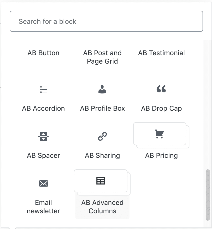
After updating your Atomic Blocks plugin, you can find the Advanced Columns block in the Atomic Blocks tab or by searching for advanced, columns, and then layout.

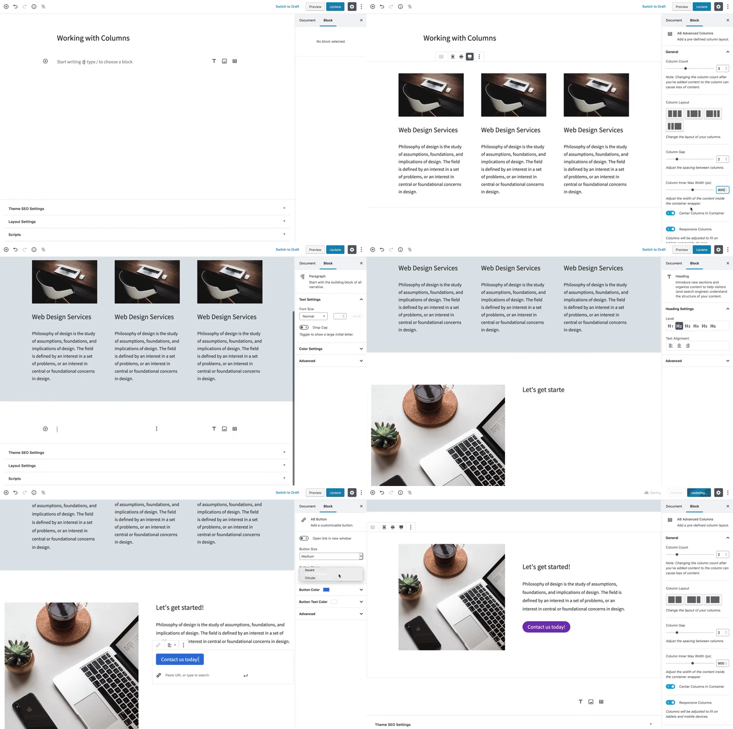
Watch this animation to get a feel for what’s possible with this amazing block:

Once added, you will be presented with the option to choose how many columns you want to add, between one and six columns. If you choose two, three, or four columns, you’ll have the option to choose between different layouts available for those columns. There are no additional column layouts for the one, five, or six column layouts.
After you’ve selected your column number and layout, your columns will be added to the page and you can start adding content and customizing the column settings.
Column Wrapper Settings
Using the Block Navigation button, you can select the column wrapper by clicking AB Advanced Columns. The settings for the column wrapper will be shown in the inspector sidebar.
- Column Layout – Use the Column Layout setting to adjust the layout of your columns. Your content will remain intact in its respective columns and the layout will shift based on the layout you choose.
- Column Gap – Change the width of the gutter between your columns.
- Column Inner Max Width – Change the width of the content inside the container wrapper. This will allow you to have your column container (and background color) stretch the full width of your page while keeping the content inside the container at a certain width.
- Center Columns in Container – Enable this option to center the columns on the page when a max-width is used.
- Responsive Columns – Enable Responsive Columns to enable smart stacking of columns on tablets and mobile devices.
- Margin and Padding – Adjust the margin and padding around your column content. Both margin and padding come with the option to select which measurement unit you would like to use in adjusting your spacing (pixels, percent, and ems). Margin and padding also both have the option to sync the range slider to adjust the values at the same time, instead of individually. This is handy if you want to quickly adjust the padding on all sides of your column.
- Color – Change the background color and text color of the column container.
Individual Column Settings
Each individual column also has a set of settings that can be adjusted.
- Margin and Padding – The same margin and padding settings found in the column container can be found on each individual column.
- Color – Change the background color and text color of each individual column.
- Vertical Alignment – When an individual column is selected, the toolbar will display vertical alignment options that let you vertically align the column to the top, center, or bottom of the container. This is helpful when you want your column content to be vertically aligned together.
Go ahead and try it out!
The new Advanced Columns block can do more than I have touched on here and we believe it now provides you with the most powerful, flexible, responsive grid system for publishing in WordPress.
Get Atomic Blocks
Find more information, instructions, and download
