I can’t believe I’m writing this, but it’s been a year since we launched StudioPress Sites.
It feels like yesterday, but yet, so much has happened. We began offering monthly billing in June, we added free migrations for annual plans in October, we added our third plan, Synthesis, in December… and so much more.
In September we also surpassed our first major active Sites product milestone.
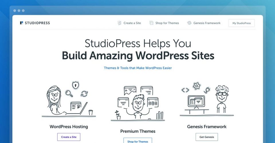
Today, though, I’d like to talk about something that’s happened behind the scenes, which culminated in the newly redesigned StudioPress.com you see today.
And that is customer research.
Never Stop Listening
When you launch a new product, of course you should do everything you can to figure out who your customers are and what they want before the product launches. But that doesn’t mean you stop learning once you’ve made your first sale.
Six months after Sites hit the market, we began a customer research crusade, using every tool we had to understand what our customers thought about Sites.
First, we used Hotjar heatmaps, recordings and pop-up polls to learn more about how potential customers interacted with the sales pages, and what questions or concerns they had about the product.
Then, we surveyed our core communities, our existing StudioPress customers and our affiliates, to hear what they thought about Sites. And of course, we reached out to existing Sites customers, both active and cancelled. We even interviewed five of these customers to get deeper feedback.
After wading through website data, survey results, interview transcripts and heatmaps, we started to see some trends in the feedback. And we realized StudioPress.com needed a redesign.
Why We Redesigned StudioPress.com
In regards to Sites specifically, our customer research revealed that some of the things our customers really loved about Sites weren’t getting enough focus in our marketing.
For example, nearly all our customers said the included themes were one of the best things about Sites. It makes sense: instead of buying Genesis and a theme for more than $100 and having to install it yourself, you can get started right away with more than 20 pre-installed themes for as little as $27.
When people talked about Sites, the included themes were almost always part of their description. So, we knew our marketing needed to play that up.
But even beyond Sites itself, we discovered that although we knew our markets and our products intimately, our website didn’t do enough to help potential customers figure out which product they needed.
Any WordPress enthusiast knows it’s a complicated industry — and if you’ve forgotten, try explaining themes to your great-aunt at your next family gathering.
Now that we sell three different types of products that solve three different customer needs, we need a website that guides potential customers to the product that’s right for them.
This insight sparked a redesign that our designer Rafal calls the most significant change to our website that he can remember — and he’s been with us a good while 😉
Translating Insights into Design
We began this redesign with the basics. First, we restructured the entire navigation and divided it into sections: one for each Sites, Themes, and Genesis. This will help customers know which product they’re looking at, wherever they are in the site.
To visually differentiate these sections, we gave each product its own color. Sites is now bright purple, our familiar blue represents Themes, and the Genesis Framework is all black. We also redesigned the logos for Sites and Genesis, to strengthen their positions as key products.
There’s still room for improvement in each section, but the new navigation, logos and colors form a strong foundation for what’s to come.
Next, we took a hard look at our homepage. Now that we have three product sections in our website, we needed the homepage to be a welcome center that orients new visitors and gets them where they need to be.
The new homepage mirrors the three-section approach of the navigation, and it features a much more simplified design, for both visuals and copy.
Because the homepage is a starting point for new visitors, we wanted our first impression to be comfortable and friendly. Short, concise copy in small paragraphs is easier to read, and doesn’t overwhelm first-time visitors. Copious white space helps visitors focus on one section of the page at a time, without too much distracting clutter in their peripheral vision.
For a finishing touch, we added cheerful illustrations and animations across our site, partly to help explain the concepts behind our products… but mostly, we love these illustrations because we feel they better reflect our brand personality: friendly, helpful, and upbeat.
After all, creating your website and shopping for a new theme is exciting. You might be starting a new business, finally pursuing your passion project, or helping a friend.
We want our site design to match your feelings of excitement, and let you know that with StudioPress, you’re working alongside real people who are just as passionate and excited about your website as you are.
So… How’s it Going?
We only launched the redesign last week, so we’re not ready to make any firm calls on how it’s affected our bottom line. But early results are promising: new Sites increased slightly compared to the previous week, and our total revenue is up.
Of course, no redesign is perfect. Even based on just the first few days of data, we already see areas we can improve, which will hopefully boost sales over time and provide a better experience for our customers.
As Rafal put it, “It’s all one big experiment that we’ve just started, and we will keep testing, measuring, and improving.”
It’s not glamorous, but we believe the path to business success is incremental. It’s about strategy, long-term trends, and, of course, listening and responding to you, our customers.
Thanks for reading this post, and for providing the feedback that made this redesign possible.
